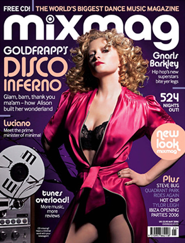
The first one I looked at was an edition of Mixmag. Compared to most magazines, this appears to be lacking in colours but it could be possibly due to the model on the front cover wearing a robe that blends well with the background.
Like every magazine, the cover features a masthead which shows the brand's title. For the purposes of this coursework, 'masthead' will be used to refer as the title of the magazine, as there are two debated definitions for 'masthead'. The 'g' in 'Mixmag' is a descender and covers up some of the blank space left around the model.
This magazine also has a tag line which is a short, memorable piece of text that sums up the mood of the magazine. "The world's biggest dance music magazine" is a buzzword which makes the magazine sound dramatic and grand, which makes it enticing to the audience. The main buzzwords on this front cover are 'biggest', 'glam', and 'overload'.

Overline: introductory headline in smaller text above the main headline ~ "Goldfrapp's". This is not a proper example of an overline, but the typography makes it seem like one.
Splash: main front page story
Wob is also present on this cover. Wob is just a term used to define white text on a black or other coloured background.

A new feature is the dropshadow, which is used in the masthead to give it a more 3D appearance. It is also used in the headlines.
This front cover also features a boost picture underneath the main model's face.


One notable thing about these music magazines is that they both have consumables for the readers. Even more notable is that in the majority of the music magazines I've seen, they always show this offer in the top left corner of the front cover. Another important thing is to make sure the barcode is noticeable, and in both of these magazines the barcode is placed on the bottom right corner.

No comments:
Post a Comment